
-1.avif)

A delivery leader opens the weekly dashboard. Tasks are moving. Milestones are scheduled. Charts summarize hours logged. Everything looks fine.
Then the real questions begin: Which projects are drifting toward budget overruns? Which engagements are quietly accumulating delivery risk? The dashboard contains data, but it does not answer these questions.
Then the real questions begin.
Which projects are drifting toward budget overruns? Which client engagements are quietly accumulating delivery risk?
Which teams will be over capacity next month? Which milestone delays will affect customer commitments or your revenue?
The dashboard contains data, but it does not answer these questions.
This situation is all too common in organizations managing multiple concurrent projects across different teams, clients, and timelines.
As project environments grow more complex, dashboards default to becoming visual summaries of activity rather than systems that surface the signals needed for decisions.
The result: hours spent on reporting, but no clarity on what is actually breaking and need arising for root cause analysis.
The core problem
In mature organizations, project management dashboards begin to fail when they prioritize activity over decision signals.
A high task completion rate does not confirm a project is on track, nor does a timeline view reveal whether delivery effort is consuming budget faster than planned.
A green milestone could be hiding resource pressure or scope drift beneath the surface.
A well-designed dashboard connects execution data to the questions delivery leaders must actually answer: whether progress is aligned with the plan, whether cost consumption is pacing with delivery milestones, whether resources are being utilized sustainably, and whether any emerging risks are approaching a threshold where intervention becomes necessary.
This guide explains how to design dashboards that do that. It covers structure, KPIs, components, and real-world examples to produce dashboards that guide what happens next.
What a project management dashboard means

A project management dashboard is the single place delivery leaders go to answer: Is this project on track? Are we consuming budget faster than we are delivering? Are resources overcommitted?
Instead of reviewing multiple systems, they see execution progress, financial performance, and resource pressure in one view.
Instead of reviewing multiple systems or reports, delivery leaders can examine a consolidated view of the metrics that determine whether a project remains aligned with its planned scope, timeline, and budget.
What it governs
Within project operations, dashboards typically support three forms of governance.
- Visibility: Dashboards provide a shared view of project progress across stakeholders, ensuring that delivery teams, leadership, and clients are working from the same operational information.
- Accountability: By linking execution activity to defined metrics and targets, dashboards make performance measurable and easier to review.
- Decision cadence: Dashboards structure the rhythm of operational reviews, providing the signal that informs weekly project meetings, delivery leadership reviews, and portfolio discussions.
- Executive management relies on project management dashboards for portfolio management, enabling strategic oversight, resource allocation, and alignment of multiple projects with organizational goals.
When designed properly, dashboards reduce the need for manual reporting because the relevant signals are already visible within the system.
What it is not
A dashboard is not a task list. It is not a planning tool. It is not a deck you present in meetings. It is a signal layer.
Instead, dashboards should take complex data such as project metrics, KPIs, and resource information, and simplify it into actionable signals.
Each of those artifacts has its own purpose. The dashboard’s role is to translate operational complexity into a limited set of signals that can be interpreted quickly by the people responsible for making delivery decisions.
In practice
In delivery organizations that rely heavily on project execution, dashboards are reviewed on a defined cadence.
Project managers (PMs) typically use them throughout the week to monitor task progress and detect early signs of variance.
Delivery leaders examine them during weekly reviews to identify risks across projects. Executives rely on portfolio-level dashboards to assess performance trends and capacity planning.
Over time, the dashboard becomes the single source of truth.
Dashboards play a crucial role in managing projects efficiently by providing real-time insights into tasks, timelines, and resources, which enhances visibility and streamlines workflows.
Instead of generating manual updates for each review cycle, teams can focus their attention on interpreting the signals already visible within the dashboard and deciding how to respond.
The enterprise problem map (why dashboards break)
.avif)
Most dashboards break when delivery environments scale. A simple status view works when you are managing three projects. It fails when you are managing thirty.
Enterprise delivery environments introduce a very different reality.
Professional services teams often run dozens of concurrent projects across distributed teams, each with different timelines, staffing models, and contractual expectations.
Project activity flows through multiple operational systems, including project management platforms, time tracking tools, financial systems, CRM pipelines, and resource planning software.
Managing multiple project portfolios and different projects with varying requirements adds significant complexity, as leaders must oversee strategic alignment and resource allocation across diverse initiatives.
A dashboard sits on top of this landscape and attempts to compress all of that activity into a view that leaders can interpret quickly.
However, as complexity grows, dashboards tend to weaken in predictable ways. The breakdown rarely originates in the visual design of the dashboard. It emerges in the operational systems and processes feeding it.
When those systems begin drifting out of sync, the dashboard gradually loses its ability to represent delivery conditions accurately.
Understanding these structural failure patterns helps explain why many organizations maintain dashboards diligently yet still struggle to identify emerging delivery risks early enough to intervene.
Common failure patterns
Visibility gap
The usefulness of a dashboard depends on how closely its data reflects current delivery activity. In many organizations, there is a delay between when work occurs and when it appears in reporting, making it difficult to keep dashboards up to date for accurate visibility.
Several operational habits contribute to this gap:
- Consultants often log time at the end of the week rather than at the end of the day
- Milestone updates are typically entered just before status reviews
- Vendor costs appear when invoices arrive rather than when commitments are made
- Staffing changes are reflected in systems after allocation decisions have already been implemented
By the time the dashboard surfaces a signal such as schedule variance or cost drift, the project may already have progressed beyond the point where the simplest corrections were possible.
In practice, visibility depends less on dashboard design and more on how closely operational data capture aligns with the actual rhythm of delivery.
Coordination cost
In many delivery organizations, dashboards require manual preparation before every reporting cycle.
Project managers frequently perform several coordination steps to assemble an accurate dashboard view. These steps may include:
- Exporting task progress from project management tools
- Validating time entries across team members
- Confirming milestone status with delivery leads
- Reconciling cost figures with finance systems
As the number of projects grows, the coordination effort required to maintain dashboards increases proportionally.
Reporting preparation can consume several hours each week across multiple project managers.
The result is an unusual dynamic: the dashboard displays a concise operational summary, yet substantial effort is required behind the scenes to produce that clarity.
High coordination cost also reduces reporting responsiveness. Teams hesitate to update dashboards continuously when each update requires validation across multiple systems.
Implementing advanced reporting features can reduce coordination costs by automating data consolidation and streamlining the reporting process.
Brittle process
Dashboards are often designed around the structure of a specific delivery model. Many templates assume sequential phases, predictable timelines, and a clearly bounded scope.
Modern delivery environments frequently diverge from these assumptions.
Teams may work across hybrid project models that combine structured implementation phases with iterative development cycles.
Cross-functional workstreams may progress at different speeds. Scope may evolve during delivery as new requirements emerge.
To keep pace with these changes, project management dashboards should support continuous improvement in their design, so teams can iteratively refine dashboard metrics and layouts as processes evolve.
When dashboards remain tied to rigid reporting templates, they struggle to represent these realities. Teams begin maintaining parallel tracking mechanisms that capture the aspects of delivery that the dashboard cannot easily display.
These parallel systems may include:
- Milestone trackers maintained in spreadsheets
- Resource allocation documents shared internally
- Ad-hoc status updates prepared specifically for leadership reviews
Over time, the official dashboard becomes only one reporting layer among several. Operational clarity decreases because important signals are distributed across different sources.
Siloed data
Project delivery generates several categories of operational signals. The most important ones typically include:
- Execution progress, reflected in task completion and milestone movement
- Financial performance, reflected in cost accumulation and billing progress
- Resource capacity, reflected in utilization and staffing patterns
In many organizations, these signals reside in different systems.
Project execution data sits in project management tools, cost data lives in finance or PSA systems, and resource capacity information lives in resource planning platforms.
When dashboards draw from only one or two of these systems, they produce an incomplete picture of project conditions.
The right project management software can centralize these data sources, enabling more complete and integrated dashboards that provide a holistic view of project status.
For example, a dashboard may show strong milestone progress while financial systems reveal that delivery effort is consuming budget faster than planned.
In another case, a project may appear operationally stable while resource utilization across teams approaches unsustainable levels.
Reliable dashboards require data connections across these operational layers so that execution progress, financial performance, and resource capacity appear together.
Adoption decay
Dashboards influence decisions only while teams trust the signals they display. When trust is lost, the dashboard no longer supports informed decisions, as teams can no longer rely on its data for accurate visibility, risk mitigation, or resource allocation.
Confidence begins to erode when users repeatedly encounter inconsistencies in the data. These inconsistencies often emerge from small operational patterns:
- Delayed time entry
- Inconsistent project coding practices
- Metrics that appear disconnected from real delivery conditions
When these experiences accumulate, delivery leaders begin relying on alternative sources of information.
Informal conversations, Slack updates, or internal documents gradually replace the dashboard as the primary reference point for project discussions.
The dashboard remains technically active, yet its influence on operational decisions diminishes. Adoption decay, therefore, represents a gradual shift in behavior rather than a sudden failure of the system.
Types of project management dashboards (and when to use each)
.avif)
Project environments involve multiple layers of decision-making. Individual contributors focus on tasks.
Project managers coordinate delivery execution. Delivery leaders oversee several projects simultaneously. Clients expect clear visibility into progress.
Each layer benefits from a different dashboard perspective.
Understanding these distinctions helps organizations design dashboards that support the decisions each role needs to make.
In the next section, we will look at project dashboard examples that illustrate how dashboards can be customized for different project management needs.
Project status dashboard
A project status dashboard summarizes the current state of delivery. It provides a concise view of how work is progressing across the project.
Typical elements include:
- progress across major phases or workstreams
- milestone completion status
- project timelines that visually represent schedules and highlight any delays
- Summary indicators of schedule performance
Status dashboards support routine operational reviews and help teams maintain shared visibility into project progress.
Project health dashboard
Project health dashboards focus on the overall stability of a project rather than day-to-day activity.
They typically incorporate signals that reveal whether delivery conditions remain within expected boundaries. These signals often include:
- Schedule variance relative to milestones
- Budget consumption relative to progress
- Resource utilization across delivery teams
Delivery leaders often rely on health dashboards when evaluating multiple projects simultaneously because they highlight engagements that may require intervention. By providing high-level visibility and transparency, health dashboards play a crucial role in supporting overall project success.
Project tracking dashboard
Tracking dashboards monitor execution movement across workstreams and phases. They help project managers understand how delivery activity is unfolding relative to the original plan.
Tracking dashboards are particularly useful when projects involve:
- Several parallel workstreams
- Multiple teams working across dependencies
- Iterative progress across phases
- Tracking sprint progress for Agile project management
This dashboard type helps teams identify where work is accumulating and where progress may be slowing.
Project plan dashboard
A project plan dashboard visualizes the structure of the delivery plan itself. Timeline views and milestone sequences help stakeholders understand how work is expected to unfold across the lifecycle of the project.
Plan dashboards often display:
- Phase timelines
- Milestone schedules
- Project milestones
- Dependencies between workstreams
Project managers frequently rely on this perspective when coordinating teams that depend on each other’s progress.
Project portfolio dashboard
Portfolio dashboards operate at the organizational level. They aggregate signals from multiple projects to provide leadership with a view of delivery performance across the portfolio.
Typical portfolio dashboards highlight the:
- Status distribution across projects
- Resource and billable utilization across teams
- Financial exposure across engagements
This perspective helps leadership understand how individual projects combine to affect organizational capacity and revenue outlook.
Portfolio dashboards also support project prioritization across the portfolio, enabling leadership to align projects with business goals and optimize resource allocation.
Program manager dashboard
Program dashboards focus on groups of related projects contributing to a broader initiative.
Program managers use this view to monitor cross-project dependencies and ensure coordination between teams delivering different components of the program.
These dashboards also help program managers allocate resources efficiently across multiple projects, supporting real-time monitoring and workload balancing.
Signals often include:
- Milestone alignment across projects
- Shared resource allocation
- Dependency risk between project teams
Client project dashboard
Client dashboards provide transparency into project progress while keeping the focus on deliverables and outcomes.
They typically emphasize key information relevant to the client’s perspective of the project, ensuring that essential metrics and insights are surfaced clearly, rather than focusing on internal operational metrics.
What shows on a dashboard for a client's project
A client-facing dashboard commonly includes:
- Milestone progress and deliverable status
- Upcoming work and timeline updates
- Upcoming deadlines
- High-level project progress indicators
- Summary risk or issue status
Internal financial metrics, staffing patterns, and margin analysis usually remain part of internal delivery dashboards rather than client views.
Dashboard types table
Key components of a project management dashboard
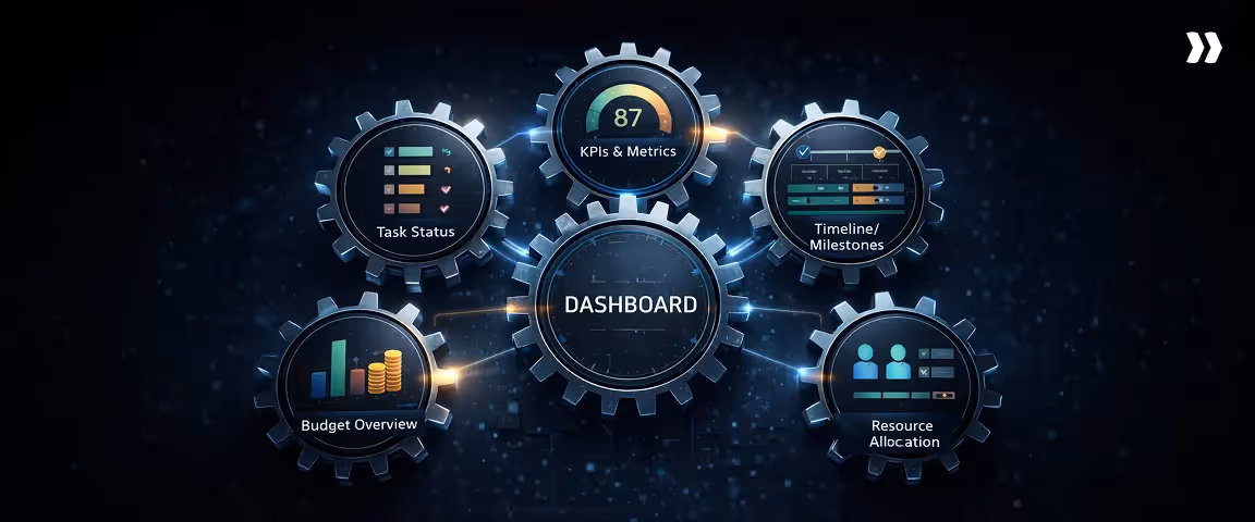
A project management dashboard is made up of several interconnected components. Each one tracks a different dimension of delivery health, and together they give delivery leaders the operational picture needed to make informed decisions.
Task status
Task status shows where active work stands across projects at any given point in time.
What to show
Current task completion rates, work in progress, overdue items, and upcoming tasks approaching their deadlines. Status should be filterable by project, team, or assignee so leaders can move between portfolio-level and project-level views without switching tools.
What to avoid
Avoid displaying raw task counts without context. A list of completed tasks tells you what happened. It does not tell you whether the right work is progressing at the right pace relative to the plan.
KPIs and metrics
KPIs translate execution activity into measurable signals of delivery health. The most useful dashboards separate leading indicators from lagging ones.
Leading vs. lagging indicators
Leading indicators provide early signals of where delivery is heading. Lagging indicators confirm what has already occurred.
Examples of leading indicators
- Resource utilization rate trending toward overallocation
- Tasks approaching due dates without progress logged
- Scope change requests submitted but not yet assessed
- Budget consumption rate outpacing milestone completion
Examples of lagging indicators
- Milestone completion rate over the past period
- Actual cost versus planned cost at project close
- Percentage of deliverables accepted on first review
- Schedule variance at phase completion
Timeline and milestones tracker
The timeline component maps planned delivery dates against actual progress, making schedule health visible at a glance.
Milestone slippage signals
Slippage rarely appears as a single large delay. It accumulates incrementally. Dashboards should flag milestones where completion confidence is low, dependencies are unresolved, or predecessor tasks are running late, giving delivery leaders time to intervene before a minor drift becomes a schedule failure.
Resource allocation
Workload and capacity view
This view shows how current task assignments compare to available capacity across team members and roles. It surfaces overallocation before it affects output and identifies underutilized capacity that could be redirected.
Resource utilization snapshot
A utilization snapshot tracks the percentage of available hours being consumed by active project work. Sustained utilization above 80 to 85 percent is a reliable early indicator of burnout risk and delivery slowdown.
Budget overview
Budget vs. actual
This component tracks planned spend against actual cost consumption at the project and portfolio level, updated continuously from integrated financial systems, so the figures reflect current conditions.
Cost risk indicators
Cost risk indicators flag projects where the burn rate is outpacing milestone delivery, where contingency reserves are being drawn down ahead of schedule, or where change requests are accumulating without corresponding budget adjustments.
Project management dashboard KPIs (that drive decisions)
Dashboards become valuable when the metrics inside them influence decisions.
Many dashboards include a large number of indicators, yet only a small subset of those metrics actually affect how delivery teams adjust staffing, timelines, or scope.
The key features of effective dashboard KPIs include clarity, relevance, and accessibility for users across different roles, ensuring that the information is actionable and easy to interpret.
When a KPI moves outside expected bounds, the response should be clear. Teams should immediately understand whether the situation requires monitoring, investigation, or corrective action.
The KPI rule (why most teams pick the wrong KPIs)
Many teams select KPIs based on what their tools measure easily, rather than what delivery decisions require. Task counts, tickets closed, or hours logged often appear prominently because the system produces them automatically.
Those metrics provide descriptive information, yet they do not always reveal whether a project remains healthy.
When selecting KPIs for your project management dashboard, ensure they are aligned with your business objectives so that the dashboard supports strategic decision-making and organizational goals.
Effective dashboard KPIs focus on relationships between operational signals. Examples include the relationship between progress and budget consumption, between planned work and completed work, or between scheduled milestones and actual delivery movement.
KPI selection filter (3 questions)
A useful way to evaluate dashboard KPIs is to ask four practical questions before including them.
- Does the metric reveal a change in trajectory?
A useful KPI shows whether delivery conditions are improving or deteriorating. - Would a leader change a decision based on this metric?
If the metric moves significantly, there should be a clear operational response. - Does the metric combine multiple delivery signals?
Metrics that connect progress, cost, and capacity often provide stronger insight than single-variable metrics. - Does the KPI support organizational objectives?
Each KPI should align with broader organizational objectives to ensure the project management dashboard remains relevant for strategic planning and decision-making.
When KPIs pass these filters, dashboards remain focused on signals that influence delivery decisions.
Here are some project management dashboard KPIs for you to consider:
Schedule variance
Definition
Schedule variance measures the difference between planned progress and actual progress within a project timeline.
What it signals
Schedule variance reveals whether execution is advancing at the expected pace. Positive variance indicates work progressing faster than planned, while negative variance indicates slippage relative to the timeline.
What to do if it’s off
Consistent negative variance often requires examination of task dependencies, resource allocation, or scope expansion. Project managers frequently address early variance by redistributing work across team members or adjusting milestone sequencing.
Milestone slippage rate
Definition
Milestone slippage rate tracks how often scheduled milestones move past their original planned dates.
What it signals
Milestone slippage reveals structural delivery pressure. Occasional adjustments may occur in most projects, yet repeated milestone movement often indicates underlying estimation challenges or coordination gaps between teams.
What to do if it’s off
When milestone slippage becomes frequent, teams usually review dependency structures and clarify decision ownership around milestone completion. Early slippage may require adjustments to downstream timelines before delays compound.
Workload utilization
Definition
Workload utilization measures how much of a team’s available capacity is actively allocated to project work.
What it signals
Utilization patterns provide insight into staffing balance. Very high utilization across multiple teams can indicate burnout risk or insufficient capacity for unexpected work. Very low utilization may indicate planning inefficiencies or pipeline gaps.
What to do if it’s off
Sustained over-utilization often leads teams to rebalance staffing across projects or bring in temporary capacity. Sustained under-utilization may prompt leadership to reallocate resources toward higher-priority initiatives.
Throughput (planned vs done)
Definition
Throughput compares the volume of planned work against the volume of work actually completed during a defined period.
What it signals
Throughput reveals whether teams consistently convert planned activity into completed deliverables. Persistent gaps between planned and completed work often signal unrealistic planning assumptions or hidden dependencies.
What to do if it’s off
When throughput consistently falls below plan, teams typically examine estimation practices and reassess task sizing or work sequencing.
When throughput consistently falls below plan, teams typically examine estimation practices and reassess task sizing or work sequencing.
Risk trend (count + severity)
Definition
Risk trend tracks both the number of active project risks and the severity level assigned to those risks.
What it signals
A rising number of moderate risks may indicate growing operational pressure even before severe risks appear. Tracking both count and severity helps teams understand whether project conditions are stabilizing or deteriorating.
What to do if it’s off
Increasing risk levels often prompt leadership to allocate additional attention to affected projects. Teams may adjust scope, staffing, or delivery sequencing to reduce exposure.
Budget variance
Definition
Budget variance measures the difference between planned project spending and actual costs incurred.
What it signals
Budget variance indicates whether delivery effort is consuming financial resources faster than expected relative to project progress.
What to do if it’s off
Early cost variance often leads teams to examine staffing patterns, vendor commitments, or scope adjustments. Detecting variance early allows projects to correct trajectory before financial exposure grows.
Estimate accuracy
Definition
Estimate accuracy measures how closely project forecasts align with actual outcomes.
What it signals
Repeated gaps between estimates and actual delivery outcomes reveal structural issues in planning assumptions. These gaps may originate from scope complexity, resource constraints, or underestimated coordination effort.
What to do if it’s off
Low estimate accuracy usually leads teams to refine estimation models and incorporate historical delivery data into future planning.
Stakeholder sentiment proxy
Definition
Stakeholder sentiment proxies approximate the confidence level of project stakeholders, often measured through feedback surveys or engagement patterns.
What it signals
Shifts in stakeholder sentiment frequently appear before operational risks become visible in delivery metrics. Reduced engagement or declining satisfaction scores may signal emerging alignment issues.
What to do if it’s off
Teams often respond by increasing communication frequency, clarifying expectations, or revisiting milestone commitments.
Need for earned value in project metrics
Earned Value Management (EVM) introduces a structured approach for evaluating project performance by connecting cost, schedule, and progress into a single analytical framework.
EVM is especially valuable when organizations need to ensure that project performance is aligned with strategic objectives, providing senior managers and executives with insights into how projects contribute to overarching project goals.
When EVM matters
Earned value metrics are particularly valuable in environments where projects involve:
- Strict contractual timelines
- Large financial exposure
- Complex multi-phase execution
In these environments, leaders require precise signals that connect cost consumption to delivery progress.
When EVM is overkill
For smaller projects with flexible timelines and simpler delivery structures, full earned value analysis may introduce unnecessary complexity. Teams in these environments often rely on simpler metrics such as milestone progress and budget tracking.
SPI and CPI (simple explanation)
Two common earned value indicators help interpret the project trajectory.
- Schedule Performance Index (SPI) evaluates whether work is progressing faster or slower than planned.
- Cost Performance Index (CPI) evaluates whether the project is spending more or less than expected relative to progress.
These indicators help delivery leaders evaluate whether schedule and cost performance remain aligned with expectations.
Project management dashboard examples and templates
Dashboards become easier to design when teams understand the operational questions each dashboard needs to answer.
Different delivery contexts call for different dashboard layouts. Below, we provide project dashboard examples to illustrate how dashboards can be customized for various project management needs.
Project management dashboard examples
Below are three commonly used dashboard structures that illustrate how teams visualize project data. Each dashboard example surfaces critical data for its audience, ensuring that essential information needed for strategic decision-making and project tracking is displayed prominently.
Example 1: Delivery/implementation dashboard
Delivery dashboards focus on execution signals that help project managers monitor progress throughout active implementations.
These dashboards often highlight:
- Milestone completion status
- Workstream progress across phases
- Workload distribution across delivery teams
- Early indicators of schedule drift
Project managers rely on this layout during day-to-day delivery coordination.
Example 2: Executive dashboard
Executive dashboards compress operational signals into a small set of strategic indicators. Leadership teams typically review these dashboards during portfolio or operational reviews.
Executive dashboards often include:
- Portfolio status distribution across projects
- High-level financial exposure indicators
- Resource utilization across teams
- Emerging risk patterns across the portfolio
Example 3: Multi-project portfolio dashboard
Portfolio dashboards aggregate signals across many projects simultaneously. Professional services organizations frequently use these dashboards to monitor capacity, revenue exposure, and delivery stability.
Typical portfolio dashboards display:
- Project status distribution across active engagements
- Resource allocation across delivery teams
- Cost trajectory across projects
- Milestone alignment across the portfolio
These dashboards help leadership understand how individual project conditions combine to influence overall delivery performance.
Project management dashboard template (what to include)
A useful project management dashboard template brings together the signals that delivery leaders actually review during weekly operations.
The goal is not to display every available metric, but to structure the dashboard around execution progress, delivery risk, resource pressure, and financial trajectory.
Most effective dashboards organize information in predictable sections so teams can scan the same signals across projects without relearning the layout each time.
This consistency becomes especially important when managing multiple projects or a broader portfolio, where cognitive load compounds quickly across reviews.
A practical template combines operational metrics, milestone visibility, staffing signals, and financial indicators in a single view. The sections below represent the structure used in mature delivery environments.
Each one maps to a question a delivery leader should be able to answer within the first few minutes of a weekly review.
Template sections checklist
Use the following structure when building or configuring a project management dashboard template.
Project overview
- Project name, client, and delivery owner
- Current phase and milestone stage
- Project start date and target completion date
Project health summary
- Overall health status indicator (on track, at risk, off track)
- Active risks or blockers affecting delivery
- Escalations requiring leadership attention or a decision
Task and workstream status
- Tasks completed versus tasks planned for the current period
- Workstream progress broken down by phase or delivery track
- Throughput rate showing planned versus completed work over time
Milestones and timeline
- Upcoming milestones with owners and due dates
- Milestones completed versus milestones planned to date
- Slippage indicators flagging milestones where completion is at risk
Resource allocation
- Assigned team members by project or workstream
- Current workload distribution across the team
- Utilization snapshot showing allocation as a percentage of available capacity
KPIs and performance metrics
- Schedule variance showing actual progress against the baseline plan
- Risk trend tracking whether the number or severity of active risks is increasing
- Throughput or delivery velocity for teams working in iterative cycles
- Estimate accuracy for organizations tracking forecast reliability over time
Budget and financial visibility
- Budget versus actual spend to date
- Estimate at completion (EAC) showing projected total cost against the approved budget
- Margin or cost risk indicators flagging projects where the burn rate is outpacing delivery progress
Stakeholder updates
- Client-facing status summary covering the current period
- Recent decisions made or approvals received
- Key deliverables due before the next review cycle
Using a consistent template structure allows teams to move through multiple project reviews quickly, because every dashboard surfaces the same operational signals in the same place. Over time, that consistency also makes it easier to spot when a project is drifting, since the baseline pattern becomes familiar enough that anomalies stand out.
Project management dashboard ideas (by role)
Different stakeholders require different dashboard perspectives. Customizable dashboards allow each stakeholder to tailor the project management dashboard to their specific needs, ensuring relevant information and insights are easily accessible for better decision-making.
For PMs
Project managers typically benefit from dashboards that emphasize operational detail. Task progress, milestone sequencing, and team workload indicators help them monitor delivery conditions closely.
For PS leaders
Professional services leaders rely on dashboards that aggregate signals across projects. Portfolio-level utilization, revenue exposure, and project health indicators help them understand organizational delivery performance.
For clients
Client portals with dashboards prioritize transparency and progress communication. Milestone completion, upcoming deliverables, and high-level status indicators help maintain alignment with client expectations.
How to build a project managament dashboard (step-by-step)
.avif)
A useful project management dashboard rarely emerges from assembling charts inside a reporting tool. To create project management dashboards that support operational oversight, it's important to choose tools that allow easy customization and deployment, even without extensive technical skills.
The structure of the dashboard should reflect how delivery decisions are made inside the organization. When teams begin with visualization instead of decision design, dashboards tend to accumulate metrics without clarifying what action those metrics should trigger.
Step 1: Define the decisions the dashboard must support
The first step in building a dashboard is clarifying the operational decisions it should inform. Delivery leaders, project managers, and stakeholders review dashboards to answer specific questions about execution.
Common examples include decisions such as adjusting staffing levels, escalating project risks, or revising milestone timelines.
For each decision, it is essential to identify the key information needed to make an informed choice. A dashboard designed around these decision points naturally highlights the signals that matter most.
Step 2: Define the KPIs and thresholds
Once the decision points are clear, the next step involves identifying the indicators that signal when those decisions should occur.
Key performance indicators help translate delivery activity into measurable signals. Selecting key metrics—such as system performance, project progress, and team workloads—ensures that the dashboard translates activity into actionable signals that support decision-making. I
n most project environments, these indicators relate to schedule progress, milestone stability, workload distribution, and financial trajectory.
Equally important are the thresholds that determine when attention is required. For example, a project may trigger review when schedule variance exceeds a defined percentage or when resource utilization approaches capacity limits.
Clear thresholds prevent dashboards from becoming passive displays. Instead, they highlight conditions that require intervention.
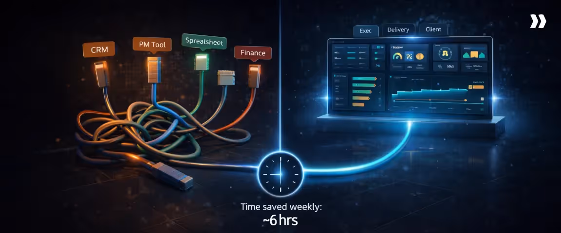
Step 3: Centralize data sources
Project dashboards rely on data from several operational systems. Centralizing those sources ensures that the dashboard reflects the full delivery picture.
By bringing all project information into one dashboard, teams gain access to real-time, comprehensive data that improves collaboration, decision-making, and project oversight.
What data sources usually exist
Typical delivery environments generate signals from multiple systems, including:
- Project management tools capturing task progress and milestone movement
- Time tracking platforms capturing delivery effort
- Financial systems recording project costs and billing data
- CRM systems showing pipeline commitments and contract details
- Resource planning platforms tracking capacity and staffing allocation
What breaks without centralization
When these signals remain disconnected, dashboards display only partial information. A project may appear operationally healthy from a task perspective while financial reports reveal cost variance. In other situations, resource capacity issues remain hidden until staffing conflicts appear across projects.
Centralizing delivery, financial, and resource data ensures that dashboards represent the combined operational picture.
Step 4: Visualize data clearly
Visualization determines how easily stakeholders interpret the signals displayed in the dashboard. A good project management dashboard should simplify complex data, making large and intricate datasets like project metrics and KPIs visually accessible and easy to interpret. Clear visual structure allows teams to identify trends and anomalies quickly.
What good visualization looks like
Effective dashboards emphasize clarity and hierarchy. Important signals appear prominently, while supporting data remains accessible without overwhelming the screen.
Good visualization typically emphasizes:
- Milestone timelines that show progress movement clearly
- KPI summaries that reveal trajectory rather than raw counts
- Resource and workload indicators that highlight imbalance
Common visualization mistakes
Visualization problems often arise when dashboards attempt to display too many metrics simultaneously. Excessive charts or overly complex visuals make it difficult to identify meaningful signals.
Another common issue occurs when metrics appear without context. A number alone rarely provides insight unless the dashboard also shows the expected range or trend over time.
Clarity improves when dashboards focus on a limited set of indicators that directly relate to delivery decisions.
Step 5: Customize for stakeholders
Different stakeholders rely on dashboards for different types of insight. Customizing views ensures that each audience receives information relevant to their role. Project management dashboards can also be tailored to suit the unique needs of different projects, providing targeted data and metrics for each team or objective.
Exec view
Executive dashboards typically summarize portfolio-level signals. Leadership teams often focus on project health distribution, resource capacity trends, and financial exposure across engagements.
The goal is to highlight where attention is required across the delivery organization.
Delivery view
Delivery dashboards provide project managers with operational details. Task progress, milestone timelines, workload distribution, and risk indicators help delivery teams monitor execution conditions closely.
This perspective supports daily coordination across teams.
Client view
Client dashboards emphasize transparency around project progress. Milestone completion, upcoming deliverables, and high-level status indicators help clients understand how delivery is progressing without exposing internal operational complexity.
The structure focuses on outcomes and commitments rather than internal operational metrics.
Step 6: Set cadence, ownership, and governance
Dashboards become meaningful when teams review them on a consistent operational cadence.
Monthly reviews are especially valuable for supporting portfolio management, as they enable high-level oversight, strategic alignment, and informed decision-making across multiple projects.
Governance structures ensure that signals displayed in the dashboard lead to action.
Weekly cadence
Weekly reviews allow project managers and delivery leaders to evaluate current execution signals. These meetings often focus on schedule variance, milestone stability, and emerging risks.
Regular cadence helps teams detect changes before they compound.
Monthly cadence
Monthly reviews often operate at the portfolio level. Leadership teams examine resource utilization patterns, financial trajectory across projects, and longer-term delivery risks.
These reviews connect individual project performance to organizational capacity planning.
Escalation rules
Governance structures also define how teams respond when metrics cross defined thresholds. Escalation rules help determine when a project requires additional oversight, resource adjustments, or leadership intervention.
Clear escalation paths prevent dashboards from becoming passive reporting tools.
Step 7: Automate updates
Automation ensures that dashboards remain current without requiring constant manual preparation.
By automatically syncing data, a project management dashboard stays up to date with real-time information, allowing teams to make informed decisions based on the latest project status.
What to automate first
Organizations often begin automation by connecting the systems that produce the most frequently updated data. These typically include:
- Task and milestone updates from project management tools
- Time tracking entries reflecting delivery effort
- Resource allocation data from planning systems
Automating these signals ensures that dashboards reflect operational conditions continuously rather than only during reporting cycles.
Over time, automation reduces reporting overhead and allows delivery teams to focus on interpreting signals rather than assembling them.
Project management dashboard checklist
Before launching a dashboard, confirm that the following elements are in place:
- The dashboard supports clear operational decisions
- KPIs include defined thresholds for intervention
- Delivery, financial, and resource data are centralized
- Visualization highlights trends and variance clearly
- Different stakeholder views are available
- Review cadence and escalation rules are documented
- Core data sources update automatically
- Key project metrics are tracked and displayed
When these conditions are met, the dashboard functions as a decision surface that helps teams monitor delivery conditions and respond early to emerging risks.
How to choose the right tool for project dashboard reporting
A project dashboard reflects the system behind it. The visual layout of charts and graphs matters far less than how reliably the platform captures and connects delivery signals.
That being said, a strong data visualization tool is essential in any dashboard platform, as it transforms raw data into interactive, visual formats that support decision-making and seamless data integration across organizations.
Many organizations invest significant time designing dashboards while the underlying tools still depend on manual reporting, fragmented integrations, or reconciliation across multiple systems.
When that happens, the dashboard becomes a presentation layer rather than a decision instrument.
Choosing a dashboard tool, therefore, involves evaluating how the system behaves inside real delivery environments. The right platform reduces reporting friction and surfaces operational signals continuously.
The wrong one creates additional reporting work while still leaving leaders uncertain about delivery conditions.
Selection criteria
Several characteristics consistently separate tools that support operational reporting from those that only produce static dashboards.
Multi-project visibility
Delivery leaders rarely evaluate projects one at a time. Professional services teams often manage dozens of client engagements simultaneously, each at a different stage of execution.
A dashboard tool must support a portfolio view where multiple projects can be evaluated together.
Strong platforms typically enable leaders to see signals such as:
- Which projects are drifting behind milestone timelines
- Where resource capacity is tightening across delivery teams
- Which engagements are consuming budget faster than expected
Multi-project visibility allows leaders to detect patterns across projects that would remain invisible inside isolated dashboards.
Integration depth
Dashboards draw their signal from operational systems. The reporting layer should connect directly to the tools that capture delivery activity and help allocate resources efficiently.
Typical sources of dashboard data include:
- Project management platforms capturing task and milestone progress
- Time tracking tools recording delivery effort
- Financial or PSA systems reflecting cost and billing data
- CRM platforms showing pipeline commitments and contract context
- Resource planning tools tracking staffing allocation
When these integrations are deep, dashboards update automatically as delivery activity changes. When integrations are shallow, dashboards rely on periodic exports that introduce delays between execution and visibility.
Permissioning and stakeholder access
Project dashboards serve multiple audiences within the same organization. Each group requires a different level of visibility.
For example:
- Delivery teams need detailed views of tasks, workstreams, and milestone dependencies
- Leadership teams need portfolio-level signals, such as risk concentration and resource utilization
- Clients typically expect progress visibility around milestones and deliverables
A capable platform supports role-based access so each stakeholder group receives the appropriate level of information without overwhelming the dashboard with unnecessary detail.
Reporting flexibility
Delivery environments rarely remain static. New project structures appear, billing models change, and leadership priorities shift.
A reporting platform should allow teams to adjust dashboards as operational needs evolve. Flexibility typically includes the ability to:
- Introduce new KPIs without redesigning the dashboard structure
- Modify filters and views for different project types
- Adapt reporting layouts as delivery processes change
Automation
Automation determines how frequently dashboards update without manual preparation.
Platforms that synchronize operational systems continuously allow dashboards to reflect delivery conditions in near real time.
Systems that rely on manual updates create reporting lag and increase preparation effort before reviews.
Automation is particularly valuable for signals that change frequently, including:
- Task progress across workstreams
- Time entry updates reflecting the delivery effort
- Staffing resource allocation changes across projects
Automated synchronization ensures that dashboards remain accurate between reporting cycles.
Admin overhead
Dashboard platforms differ significantly in the amount of ongoing maintenance they require. Some systems demand frequent configuration work, reconciliation of imported data, or manual upkeep of reporting templates.
Administrative overhead becomes increasingly important as organizations scale. Platforms that require constant maintenance often struggle to keep pace with growing project portfolios.
Evaluating administrative effort early helps determine whether a tool will remain sustainable as reporting complexity increases.
Red flags
Certain warning signs frequently appear during tool evaluation. These patterns often indicate that dashboards will struggle to provide reliable operational insight.
Certain warning signs frequently appear during tool evaluation. These patterns often indicate that dashboards will struggle to provide reliable operational insight.
Manual reporting dependency
If teams must export data from several systems and assemble dashboards manually before every review, the reporting platform is functioning primarily as a visualization layer rather than an operational system.
Manual reporting workflows typically involve:
- Exporting data from project management tools
- Reconciling time entries across team members
- Validating financial figures from finance systems
- Preparing consolidated reports before status meetings
This preparation effort grows rapidly as project portfolios expand.
Pretty dashboards with stale data
Some platforms prioritize visual design while underlying data refreshes occur infrequently. Dashboards may appear polished while reflecting information from previous reporting cycles.
In operational environments, data freshness matters more than visual sophistication.
Missing resource or budget linkage
Projects operate at the intersection of people, timelines, and cost. Tools that track task progress without connecting it to staffing allocation or financial data limit the dashboard’s ability to reveal delivery risk.
Common symptoms of this limitation include:
- Projects appearing on schedule, while resource utilization becomes unsustainable
- Strong task progress masking cost variance building underneath
- Delivery effort expanding without visibility into margin impact
Using integrated project management software can address these issues by centralizing resource, budget, and progress data, enabling real-time, customizable dashboards that improve visibility and decision-making.
Connecting execution signals with financial and staffing data allows dashboards to surface these patterns early.
Lack of role-based views
Organizations often attempt to use a single dashboard for every stakeholder. This approach creates tension between the level of detail required by delivery teams and the clarity required by leadership or clients.
Platforms that support role-based views allow organizations to create dashboards tailored to different audiences without duplicating reporting systems.
10 RFP-style questions to help you choose the right tool for project dashboard reporting
Selecting a tool for project dashboard reporting is ultimately about how well the system reflects delivery reality. Many platforms can produce attractive dashboards, but far fewer connect execution data, resource signals, and financial indicators in a way that supports operational decisions.
These RFP questions help evaluate whether a tool will support multi-project governance, real-time visibility, and reliable reporting as delivery operations scale.
1. How does the platform aggregate data across multiple projects?
This determines whether leaders can monitor portfolio-level delivery signals rather than navigating individual project dashboards.
2. Which operational systems integrate directly with the reporting layer?
Integration coverage reveals whether dashboards will include execution, financial, and resource signals together.
3. How frequently does the dashboard data refresh?
Update cadence determines whether dashboards reflect current delivery conditions or periodic reporting snapshots.
4. Can the platform create role-based dashboard views?
Role-based dashboards allow executives, delivery teams, and clients to view information relevant to their responsibilities.
5. How does the platform link project progress with resource utilization?
Connecting task progress with staffing allocation allows dashboards to reveal workload pressure and delivery capacity constraints.
6. How does the system connect financial data with project execution?
Dashboards that integrate cost signals alongside operational progress allow teams to monitor financial trajectory during delivery.
7. What administrative effort is required to maintain dashboards?
Understanding configuration and maintenance requirements helps determine whether the platform will scale with the organization.
8. How easily can new KPIs or reporting views be introduced?
Flexible reporting platforms allow dashboards to evolve as delivery priorities change.
9. How does the platform support secure dashboard access for clients?
Client-facing dashboards require controlled visibility while protecting internal operational data.
10. Does the system support automated alerts when thresholds are exceeded?
Automated alerts allow dashboards to surface risk signals between reporting cycles rather than waiting for formal reviews.
How Rocketlane helps PS leaders build the perfect project management dashboard
Instead of assembling reports from separate systems, delivery data, capacity signals, and cost indicators appear in one operational dashboard that supports weekly governance and portfolio-level decisions.
What PS leaders can track in Rocketlane dashboards
Professional services delivery environments generate signals across execution, staffing, and financial performance. Surfacing critical data in these areas is essential for operational decisions and strategic project management.
Rocketlane dashboards bring those signals together so leaders can review them in one operational view rather than reconciling multiple reporting systems.
Project health and risk
Project dashboards surface delivery signals that help leaders identify emerging issues before they compound.
Typical health signals include:
- Task velocity and milestone progress
- Risk indicators tied to delivery phases
- Early warning signals around scope expansion or schedule drift
These risk indicators play a crucial role in supporting risk management by enabling teams to proactively identify and address potential project challenges through dashboard signals.
Rocketlane’s agentic intelligence layer, Nitro, enhances this visibility further. Nitro uses specialized AI agents embedded in the delivery workflow to monitor operational signals and surface governance risks automatically.
Instead of relying only on manual status updates, dashboards can highlight patterns such as milestone slippage or emerging project instability.
Milestone tracking and slippage
Milestone visibility becomes particularly important in multi-phase implementations and onboarding programs.
Rocketlane dashboards allow delivery teams and leaders to monitor:
- Project milestones and their completion against planned timelines for delivery accuracy
- Phase transitions across projects
- Slippage patterns that affect downstream workstreams
When milestone drift occurs, it becomes visible in the dashboard quickly enough for teams to rebalance staffing or sequencing before delivery pressure spreads across the portfolio.
Workload and capacity
Resource allocation signals often determine whether delivery plans remain sustainable.
Rocketlane’s capacity planning dashboards provide a view of:
- Workload distribution across consultants and delivery teams
- Capacity availability across active and upcoming projects
- Utilization patterns that affect staffing decisions
These dashboards play a crucial role in managing resources proactively, enabling team leads to visualize and distribute workloads effectively to maintain productivity.
Nitro’s resource management agents extend this capability by analyzing allocation patterns and highlighting potential overcommitment risks before they translate into delivery disruption.
Time tracking impact
Time tracking signals influence both delivery visibility and billing accuracy. When time entry discipline declines, dashboards lose their ability to reflect real delivery effort.
Accurate time tracking also enables teams to track progress in real time, ensuring that project metrics and task completion are monitored effectively.
Rocketlane dashboards connect time tracking data directly to project reporting, allowing teams to observe:
- Logged effort by phase and task
- Billable versus non-billable distribution
- Delivery effort trends across projects
Nitro’s Time Policies Agent can monitor time entry patterns and flag inconsistencies such as missing logs or delayed submissions, helping maintain the reliability of dashboard signals.
Financial visibility signals
Financial indicators become significantly more useful when they appear alongside delivery progress.
Rocketlane dashboards allow leaders to review:
- Budget consumption across project phases
- Margin trajectory during delivery
- Forecast changes tied to staffing or scope adjustments
With real-time data, these dashboards support effective budget management by providing continuous visibility into project finances and helping prevent budget overruns.
Since project execution, time tracking, and billing workflows operate within the same system, financial signals remain connected to delivery activity as opposed to appearing only during month-end reconciliation.
Best practices Rocketlane supports
Dashboards become far more useful when they operate inside consistent delivery processes. Rocketlane supports several project governance practices that help teams maintain reliable dashboard signals.
These practices also foster continuous improvement by enabling teams to use real-time metrics from the dashboard to iteratively refine processes and enhance project outcomes.
Standardized dashboard templates
Delivery organizations often repeat similar project structures across clients. Rocketlane allows teams to establish standardized dashboard templates aligned with those engagement models, ensuring that key delivery signals and key information remain consistent and clearly visible across projects.
Automated reporting cadence
Dashboards work best when data flows continuously rather than being prepared manually before reviews.
Rocketlane automates much of this reporting flow by connecting time approvals, task progress, resource allocation, and billing signals directly to project dashboards.
This ensures your dashboards are always up to date automatically, so teams have the latest information without manual intervention.
Role-based stakeholder views
Different stakeholders require different levels of visibility. Rocketlane dashboards can be configured to provide:
- Operational views for delivery teams
- Portfolio-level views for leadership
- Structured progress views for clients
With customizable dashboards, each stakeholder can tailor their project management dashboard to display the most relevant information, ensuring that everyone has a personalized and effective overview.
This keeps dashboards readable while preserving the signals each group needs.
Client-friendly visibility
Many professional services teams provide clients with limited dashboard access to track delivery progress. Rocketlane offers a dedicated customer portal as well as controlled client visibility on internal tasks so external stakeholders can monitor milestone progress and deliverables without exposing internal operational details.
The dashboard is designed to surface key information for clients, ensuring they can quickly view essential metrics and updates relevant to their projects.
See how delivery teams use Rocketlane to track project health, monitor risks, and keep every stakeholder current without rebuilding dashboard reports from scratch.
Sign up for an expert demo with the Rocketlane team.
Conclusion
Project management dashboards create value when they operate as decision systems. Their purpose is to surface signals early enough for teams to act, not to produce a record of what already happened.
Effective dashboards begin with a clear framework. Identify the decisions the dashboard must support, select KPIs that expose delivery trajectory, and structure the layout around the signals leaders actually review: milestone progress, resource capacity, active risks, and budget movement against plan.
movement against plan.
Tool selection determines how reliable those signals become.
Dashboards built across disconnected systems depend on manual reconciliation, which creates a gap between when a problem emerges and when leadership sees it.
Platforms that integrate project execution, time tracking, resource planning, and financial data close that gap.
Rocketlane connects all of those layers into a single operational view, so dashboards reflect what is actually happening across the portfolio without a reporting cycle in between.
Rocketlane customers have cut implementation timelines from six months to 30 days, achieved 85% billable utilization, and delivered 59% faster time-to-value, outcomes that depend on having accurate, current delivery data visible in one place.
See what Rocketlane customers are achieving with the right tool.


.webp)